
 ワークシート
 ぬりえ
 迷路
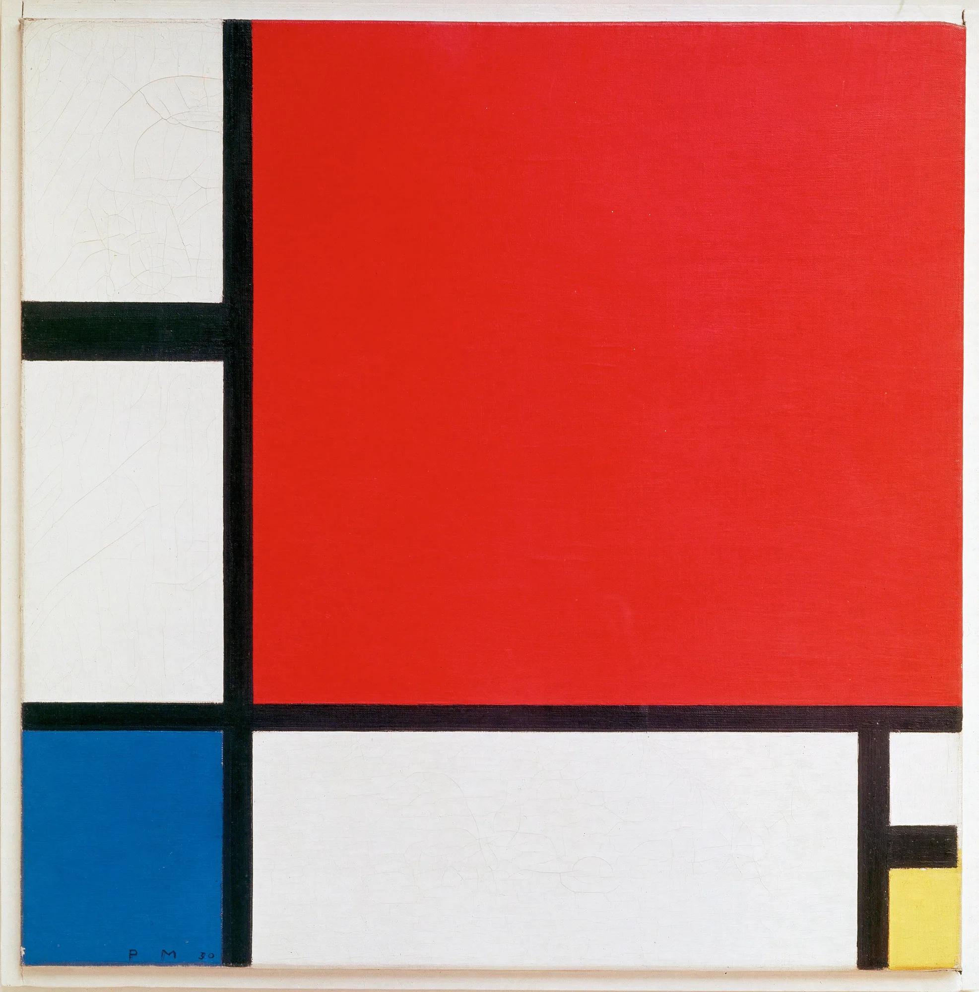
線と3色だけ!なのにのちのデザインに大きな影響をあたえた45cmの正方形。Just lines and three colors, yet Mondrian's grids strongly influenced modern design.
この作品のお話
Story白い画面を黒い線が区切り、大きな赤、小さな青と黄色の四角が置かれています。描いたのはオランダの画家ピート・モンドリアン。1930年、パリで描いた45センチ四方の小さな絵で、今はスイスのチューリッヒ美術館にあります。左下には「PM 30」というサインが見えます。
Black lines divide a white canvas. There is a large red rectangle and small blue and yellow blocks. The Dutch painter Piet Mondrian made this small picture in Paris in 1930. It is only 45 centimeters wide. Today it is in the Kunsthaus Zürich. You can see 'PM 30' at the bottom left.
モンドリアンも最初は風景や木を描いていました。木の形をどんどん単純にしていくうちに、たどり着いたのが、縦と横の線と、赤・青・黄の三原色、そして白・黒・灰色だけで、まっすぐな線を使って描く方法です。彼はこれを「新造形主義」とよび、世界の調和を表すと考えました。
At first, Mondrian painted landscapes and trees. He made the shapes of trees simpler and simpler. In the end, he used only straight lines, the three primary colors, and white, black and gray. He called this style Neo-Plasticism. He believed it could show the balance of the world.
この絵はスイスの建築家アルフレート・ロートのたのみで描かれ、1987年にロート本人から美術館に寄贈されました。モンドリアンの線と色の組み合わせは、のちにファッション、建築、ポスター、ゲームなどのデザインに大きな影響をあたえ、20世紀を代表する、だれもが知るデザインの一つになりました。
Mondrian painted it for the Swiss architect Alfred Roth. Roth gave it to the museum in 1987. Mondrian's grids of black lines and primary colors later influenced fashion, architecture, posters and games. His style became one of the most recognizable designs of the 20th century.
この絵には黒い線と3つの色があります。大きな赤い四角があります。少しの青と、とても小さな黄色もあります。画家は最初、木を描いていました。のちに線と色だけを使うようになりました。
This painting has black lines and three colors. There is a big red block. There is a little blue and a tiny yellow. The painter first painted trees. Later he used only lines and colors.
英語のレベルは上の「やさしい/ふつう」で切りかえられます。
えっ!?な裏ネタ
Secretsカンヴァスの裏には、モンドリアンがフランス語で書いた献辞があります。「わが友であり同僚のアルフレート・ロートへ」と始まり、芸術でも人生でもつり合いを求めることが未来を準備する、という言葉と、1930年1月30日の日付が書かれています。
On the back, Mondrian wrote a dedication in French to 'my dear friend and colleague Alfred Roth'. He wrote that looking for balance in art and in life prepares the future. It is dated 30 January 1930.
チューリッヒ美術館によると、モンドリアンはこの絵のあと、同じ構図を縦横5センチずつ大きくした絵も描きました。ところが黒い線の太さは変えなかったそうです。線と面の比率が少し変わるだけで印象が変わるか、確かめたかったのかもしれません。
According to the Kunsthaus, Mondrian then painted the same design again, 5 cm bigger on each side. But he kept the black lines the same width. Maybe he wanted to see how a small change felt.
本名はオランダ語つづりの「Mondriaan」。1912年ごろパリに移ったころから、「a」を1つ減らした「Mondrian」と名乗るようになりました。新しい芸術の都で、新しい自分になるためだったと考えられています。
His real name was spelled 'Mondriaan' in Dutch. Around 1912, after moving to Paris, he started to write it as 'Mondrian', with one less 'a'. It was a new name for a new life.
1965年、デザイナーのイヴ・サン=ローランは、モンドリアンの絵をもとにしたワンピース「モンドリアン・ルック」を発表して大評判になりました。絵がそのまま服になったようなデザインで、今も美術館に収蔵されています。
In 1965, the designer Yves Saint Laurent made dresses based on Mondrian's paintings. The 'Mondrian dresses' were a huge hit. Some are now kept in museums.
ここを見て!
Look Closer1大きな赤The big red rectangle
画面の半分以上をしめる赤。でも中心からずらして置かれているので、どっしりしすぎず、動きが感じられます。
The red fills more than half the picture. It is not in the center, so the picture feels alive, not heavy.
2左下の青Blue at the bottom left
大きな赤と対角線の位置にある青。小さいけれど濃い色で、赤とつり合いをとっています。
The blue sits across from the red. It is small but strong, so it balances the red.
3小さな黄色A tiny yellow block
右下のすみにある、いちばん小さな黄色。これがなかったら、絵の重さが左にかたむいてしまいそうです。
The smallest block is yellow, in the corner. Without it, the picture might feel too heavy on the left.
4サイン「PM 30」Signature 'PM 30'
青の下に、ピート・モンドリアンの頭文字と1930年の「30」が書かれています。
Under the blue, you can see his initials and '30' for 1930.
英語で名画を語ろう
Talk about Art in EnglishThe canvas is divided into rectangles by black lines.
画面は黒い線で長方形に分けられています。
💡 divide A into B で「AをBに分ける」。受け身で絵の構成を説明できます。
英語で説明すると… Describe it
これは正方形の絵です。太い黒い線で長方形に分けられています。右上には大きな赤い四角があります。左には青い四角、右下のすみには小さな黄色い四角があります。
This is a square painting. It is divided into rectangles by thick black lines. In the top right, there is a big red rectangle. There is a blue block on the left and a small yellow block in the bottom right corner.
考えてみよう Think & Talk
- もし黄色の四角がまん中にあったら、印象はどう変わると思いますか?What would change if the yellow block were in the middle?
- あなたの町で、モンドリアンのようなデザインを見つけられるのはどこですか?Where in your town can you find designs like Mondrian's?
この作品の英単語
WordsRed, blue and yellow are primary colors.
赤・青・黄は原色です。
The small yellow block keeps the balance.
小さな黄色がつり合いを保っています。
Mondrian used only straight black lines.
モンドリアンはまっすぐな黒い線だけを使いました。
Black lines divide the white canvas.
黒い線が白い画面を分けています。
ミニクイズ
QuizQ. モンドリアンが使った色の組み合わせは?Which colors did Mondrian use with black and white?
三原色の赤・青・黄に、白・黒・灰色だけで描くのがモンドリアンのルールでした。
His rule was to use only the primary colors plus white, black and gray.
ウソ?ホント? モンドリアンも、若いころは木や風景を描いていた。When he was young, Mondrian painted trees and landscapes.
木の形を少しずつ単純にしていき、線と色だけの絵にたどり着きました。
He slowly made trees simpler until only lines and colors were left.
ウソ?ホント? この絵は定規を使わずに、たった1時間で描かれた。He painted this in one hour without a ruler.
モンドリアンは線の位置や太さを何度も調整する、とても慎重な画家でした。
Mondrian was very careful. He often adjusted lines again and again.
 画像の出典とライセンス / Image credit
- PDPiet Mondriaan, 1930 - Mondrian Composition II in Red, Blue, and Yellow.jpg(Wikimedia Commons)
ライセンス:Public domain(パブリックドメイン)/作者・撮影者の表記:Piet Mondrian/提供元:[1]
この作品は、作者の死後長い年月がたち著作権の保護期間が終わった「パブリックドメイン」の作品です。画像は平面の作品を忠実に写したもので、新しい著作権は生じません(Wikimedia Commons の PD-Art の考え方)。 所蔵:チューリッヒ美術館(Kunsthaus Zürich)。画像は表示のために縮小・WebP 形式に変換しています。